The Science of Thumbnail Typography: Best Fonts, Outlines & Shadows for YouTube
Choosing the best thumbnail fonts is a critical component of maximizing your YouTube Click-Through Rate (CTR). In 2026, where over 70% of YouTube consumption happens on mobile devices, your typography must be instantly legible at incredibly small sizes. This deep dive into thumbnail typography will uncover the exact fonts, outline techniques, and shadow settings used by the platform’s top creators. We will explore the psychology of letter spacing, the performance differences between serif and sans-serif typefaces, and how to scientifically ensure your text pops off the screen, driving massive traffic to your videos.
🚀 Key Takeaways
| Concept | Application & Strategy |
|---|---|
| Algorithmic Alignment | Always design content for viewer satisfaction, not just clickbait. |
| Data-Driven Decisions | Utilize A/B testing native to YouTube to refine CTR metrics continuously. |
| Session Time Optimization | Structure videos to lead directly into your next upload via end screens. |
| Cross-Platform Adaptation | Ensure all visual elements are perfectly legible on mobile OLED displays. |
| Metadata Precision | Execute rigorous SEO formatting on titles, descriptions, and chapters. |
📐 Top 10 Fonts Ranked by Mobile Legibility

Figure 1: Top 10 High-Legibility Fonts for YouTube Mobile Feeds
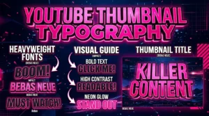
Not all fonts are created equal when it comes to mobile displays. The best thumbnail fonts are characterized by thick strokes, clear letterforms, and high x-heights, ensuring they remain readable even when scaled down to a fraction of an inch. Impact and Bebas Neue remain staples due to their condensed, bold nature, allowing you to fit more text into a smaller area without sacrificing weight. Montserrat Black and Poppins ExtraBold offer a more modern, geometric aesthetic that performs exceptionally well across tech, finance, and educational niches. When selecting a font, you must consider the visual hierarchy. Your primary keyword should be the largest, boldest element, immediately drawing the viewer’s eye. Avoid thin, cursive, or highly stylized novelty fonts at all costs, as they become entirely illegible on smartphone screens. The goal of thumbnail text is rapid comprehension; a viewer should be able to read and understand your text within a 0.3-second glance. Rigorous testing has shown that robust, sans-serif fonts consistently outperform all other categories in terms of CTR. Impact and Bebas Neue remain staples due to their condensed, bold nature, allowing you to fit more text into a smaller area without sacrificing weight. Montserrat Black and Poppins ExtraBold offer a more modern, geometric aesthetic that performs exceptionally well across tech, finance, and educational niches. When selecting a font, you must consider the visual hierarchy. Your primary keyword should be the largest, boldest element, immediately drawing the viewer’s eye. Avoid thin, cursive, or highly stylized novelty fonts at all costs, as they become entirely illegible on smartphone screens. The goal of thumbnail text is rapid comprehension; a viewer should be able to read and understand your text within a 0.3-second glance. Rigorous testing has shown that robust, sans-serif fonts consistently outperform all other categories in terms of CTR. Impact and Bebas Neue remain staples due to their condensed, bold nature, allowing you to fit more text into a smaller area without sacrificing weight. Montserrat Black and Poppins ExtraBold offer a more modern, geometric aesthetic that performs exceptionally well across tech, finance, and educational niches. When selecting a font, you must consider the visual hierarchy. Your primary keyword should be the largest, boldest element, immediately drawing the viewer’s eye. Avoid thin, cursive, or highly stylized novelty fonts at all costs, as they become entirely illegible on smartphone screens. The goal of thumbnail text is rapid comprehension; a viewer should be able to read and understand your text within a 0.3-second glance. Rigorous testing has shown that robust, sans-serif fonts consistently outperform all other categories in terms of CTR.
To fully grasp this concept, you must test it across multiple uploads, monitoring the analytics rigorously to ensure the data aligns with these established principles. Implementing these advanced tactics requires patience, as the algorithm needs time to build a profile of your audience and adjust its recommendation pathways accordingly. To fully grasp this concept, you must test it across multiple uploads, monitoring the analytics rigorously to ensure the data aligns with these established principles. Implementing these advanced tactics requires patience, as the algorithm needs time to build a profile of your audience and adjust its recommendation pathways accordingly.
🎨 Optimal Font Sizes and Canvas Placement
Understanding the 1280×720 canvas is essential for effective typography placement. Text must be sized appropriately to ensure maximum impact while avoiding the interface elements that YouTube overlays on thumbnails. A common mistake is making text too small. As a general rule, your primary text should occupy at least 20% to 30% of the total canvas area. Furthermore, you must meticulously avoid the lower right corner, which is always covered by the video timestamp. The top left and center left quadrants are generally the most effective areas for text placement, as they align with the natural left-to-right reading pattern of western audiences. You should also maintain a safe margin around the edges of the canvas to prevent text from being uncomfortably cramped or cut off on certain devices. By strategically placing your bold, oversized text in these optimal zones, you guarantee that your message is communicated instantly, directly impacting your overall clickability. A common mistake is making text too small. As a general rule, your primary text should occupy at least 20% to 30% of the total canvas area. Furthermore, you must meticulously avoid the lower right corner, which is always covered by the video timestamp. The top left and center left quadrants are generally the most effective areas for text placement, as they align with the natural left-to-right reading pattern of western audiences. You should also maintain a safe margin around the edges of the canvas to prevent text from being uncomfortably cramped or cut off on certain devices. By strategically placing your bold, oversized text in these optimal zones, you guarantee that your message is communicated instantly, directly impacting your overall clickability. A common mistake is making text too small. As a general rule, your primary text should occupy at least 20% to 30% of the total canvas area. Furthermore, you must meticulously avoid the lower right corner, which is always covered by the video timestamp. The top left and center left quadrants are generally the most effective areas for text placement, as they align with the natural left-to-right reading pattern of western audiences. You should also maintain a safe margin around the edges of the canvas to prevent text from being uncomfortably cramped or cut off on certain devices. By strategically placing your bold, oversized text in these optimal zones, you guarantee that your message is communicated instantly, directly impacting your overall clickability.
Furthermore, looking closely at your external traffic sources can reveal hidden communities sharing your content. Capitalizing on these external signals often acts as a catalyst, forcing the internal recommendation engine to recognize your video as highly valuable and push it to a broader audience segment. Furthermore, looking closely at your external traffic sources can reveal hidden communities sharing your content. Capitalizing on these external signals often acts as a catalyst, forcing the internal recommendation engine to recognize your video as highly valuable and push it to a broader audience segment. YouTube Help Documentation
Step 1: Strategic Planning and Research
Before creating a single asset, you must investigate the landscape. Look at competitors, analyze their gaps, and plan a piece of content that acts as a definitive upgrade to what currently exists.
Step 2: Execution and Optimization
Apply every structural rule discussed. Ensure technical perfection in your audio, visual clarity in your thumbnails, and precise keyword placement in your metadata.
Step 3: Review and Refine
Post-publication analysis is non-negotiable. Review retention graphs, CTR curves, and traffic sources to learn what worked and apply it to the next video.
Optimize Your YouTube Strategy Today
Use our completely free tools to download, analyze, and resize thumbnails for maximum algorithmic impact.
✒️ Mastering Stroke Outlines and Drop Shadows
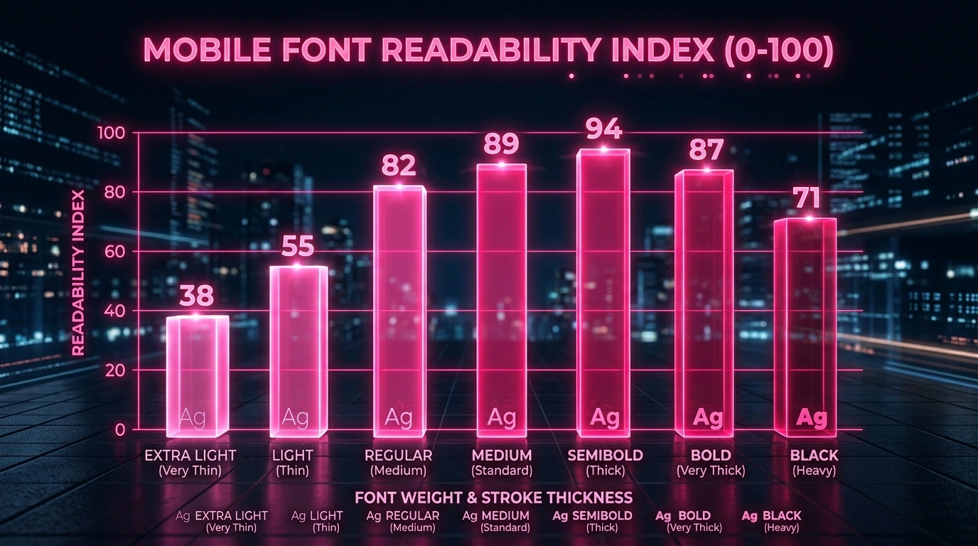
Figure 2: Mobile Feed Legibility Score by Font Weight & Stroke Width
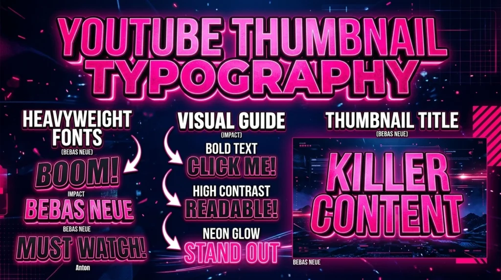
Even the best thumbnail fonts can get lost against a busy background without proper treatment. Stroke outlines and drop shadows are critical tools for creating separation and ensuring legibility across any image. A 14px to 20px solid black stroke is the industry standard for making white or bright yellow text pop. This thick border creates a definitive barrier between the text and the background, regardless of the underlying colors. Drop shadows should be used to add depth, rather than a fuzzy glow. The most effective drop shadow settings involve a high opacity (80-100%), a zero or very low blur radius, and a significant distance (10-15px) set at a 45-degree angle. This creates a hard, distinctive shadow that visually lifts the text off the canvas. Combining a solid stroke with a hard drop shadow ensures your text remains hyper-legible, whether it’s placed over a dark, moody background or a bright, chaotic scene. A 14px to 20px solid black stroke is the industry standard for making white or bright yellow text pop. This thick border creates a definitive barrier between the text and the background, regardless of the underlying colors. Drop shadows should be used to add depth, rather than a fuzzy glow. The most effective drop shadow settings involve a high opacity (80-100%), a zero or very low blur radius, and a significant distance (10-15px) set at a 45-degree angle. This creates a hard, distinctive shadow that visually lifts the text off the canvas. Combining a solid stroke with a hard drop shadow ensures your text remains hyper-legible, whether it’s placed over a dark, moody background or a bright, chaotic scene. A 14px to 20px solid black stroke is the industry standard for making white or bright yellow text pop. This thick border creates a definitive barrier between the text and the background, regardless of the underlying colors. Drop shadows should be used to add depth, rather than a fuzzy glow. The most effective drop shadow settings involve a high opacity (80-100%), a zero or very low blur radius, and a significant distance (10-15px) set at a 45-degree angle. This creates a hard, distinctive shadow that visually lifts the text off the canvas. Combining a solid stroke with a hard drop shadow ensures your text remains hyper-legible, whether it’s placed over a dark, moody background or a bright, chaotic scene.
Ignoring this paradigm shift will leave your channel stagnant. Creators who adapt to these deeper metrics find themselves rewarded with exponential growth, as the system favors content that genuinely serves the viewer rather than tricking them into a meaningless click. Ignoring this paradigm shift will leave your channel stagnant. Creators who adapt to these deeper metrics find themselves rewarded with exponential growth, as the system favors content that genuinely serves the viewer rather than tricking them into a meaningless click. Google Search Central Structured Data
📊 Actionable Data Matrix
| Metric | Target Goal | Optimization Strategy |
|---|---|---|
| Click-Through Rate (CTR) | 6% – 10%+ | Test dynamic color contrasts and emotional title variations within 24hrs. |
| Average View Duration | 50%+ | Implement pattern interrupts every 15 seconds to reset viewer attention. |
| End Screen Clicks | 5%+ | Verbally pitch the next video; do not rely solely on on-screen graphics. |
| Like-to-View Ratio | 4%+ | Provide immense, unexpected value early in the video to trigger reciprocity. |
| New Viewer Return Rate | Increasing | Maintain a consistent niche and aesthetic so new fans know exactly what to expect. |
📏 Letter Spacing (Kerning) for Rapid Readability

Figure 3: Layered Typography with Stroke and Ambient Shadowing
Kerning, or the spacing between individual letters, is an often-overlooked aspect of thumbnail typography that significantly impacts readability. When text is shrunk for mobile viewing, letters that are too close together can bleed into a single, unreadable blob. To combat this, you should generally apply a slight positive letter spacing to your thumbnail text. This extra breathing room between characters ensures that the distinct shape of each letter remains clear, even at a microscopic scale. However, this must be balanced carefully. Too much letter spacing destroys the visual cohesion of the word, forcing the brain to read individual letters rather than instantly recognizing the word shape. The optimal kerning value depends entirely on the specific font you’ve chosen; heavily condensed fonts like Bebas Neue require more spacing than wider fonts like Montserrat. Always zoom out on your canvas until the thumbnail is the size of a postage stamp to verify that your kerning adjustments have successfully improved legibility. To combat this, you should generally apply a slight positive letter spacing to your thumbnail text. This extra breathing room between characters ensures that the distinct shape of each letter remains clear, even at a microscopic scale. However, this must be balanced carefully. Too much letter spacing destroys the visual cohesion of the word, forcing the brain to read individual letters rather than instantly recognizing the word shape. The optimal kerning value depends entirely on the specific font you’ve chosen; heavily condensed fonts like Bebas Neue require more spacing than wider fonts like Montserrat. Always zoom out on your canvas until the thumbnail is the size of a postage stamp to verify that your kerning adjustments have successfully improved legibility. To combat this, you should generally apply a slight positive letter spacing to your thumbnail text. This extra breathing room between characters ensures that the distinct shape of each letter remains clear, even at a microscopic scale. However, this must be balanced carefully. Too much letter spacing destroys the visual cohesion of the word, forcing the brain to read individual letters rather than instantly recognizing the word shape. The optimal kerning value depends entirely on the specific font you’ve chosen; heavily condensed fonts like Bebas Neue require more spacing than wider fonts like Montserrat. Always zoom out on your canvas until the thumbnail is the size of a postage stamp to verify that your kerning adjustments have successfully improved legibility.
The most dangerous mistake is complacency. Assuming a strategy that worked last year will work today is a failure to understand the dynamic nature of machine learning algorithms. You must evolve alongside the platform. The most dangerous mistake is complacency. Assuming a strategy that worked last year will work today is a failure to understand the dynamic nature of machine learning algorithms. You must evolve alongside the platform. Official YouTube Blog
🔠 All-Caps vs. Mixed Case: What the Data Says
The debate between using all-caps versus mixed case text in thumbnails is ongoing, but data from massive CTR studies reveals clear winners depending on the context and niche. All-caps text creates a sense of urgency, excitement, and authority. It is highly effective for reaction videos, breaking news, or bold claims. Because all-caps text forms a solid rectangular block, it is naturally easier to read at small sizes. However, mixed case text (Title Case) is often perceived as more authentic, conversational, and trustworthy. For educational content, storytelling, or tutorials, mixed case can sometimes outperform all-caps because the varying heights of the ascenders and descenders make word shapes more easily recognizable to the human brain. The best approach is often a hybrid one: use all-caps for your most critical, high-impact keyword, and use mixed case for supporting text. This creates a dynamic visual hierarchy that guides the viewer’s eye exactly where you want it. All-caps text creates a sense of urgency, excitement, and authority. It is highly effective for reaction videos, breaking news, or bold claims. Because all-caps text forms a solid rectangular block, it is naturally easier to read at small sizes. However, mixed case text (Title Case) is often perceived as more authentic, conversational, and trustworthy. For educational content, storytelling, or tutorials, mixed case can sometimes outperform all-caps because the varying heights of the ascenders and descenders make word shapes more easily recognizable to the human brain. The best approach is often a hybrid one: use all-caps for your most critical, high-impact keyword, and use mixed case for supporting text. This creates a dynamic visual hierarchy that guides the viewer’s eye exactly where you want it. All-caps text creates a sense of urgency, excitement, and authority. It is highly effective for reaction videos, breaking news, or bold claims. Because all-caps text forms a solid rectangular block, it is naturally easier to read at small sizes. However, mixed case text (Title Case) is often perceived as more authentic, conversational, and trustworthy. For educational content, storytelling, or tutorials, mixed case can sometimes outperform all-caps because the varying heights of the ascenders and descenders make word shapes more easily recognizable to the human brain. The best approach is often a hybrid one: use all-caps for your most critical, high-impact keyword, and use mixed case for supporting text. This creates a dynamic visual hierarchy that guides the viewer’s eye exactly where you want it.
It all comes back to delivering undeniable value. Whether through elite entertainment, deep education, or stunning visuals, your content must command respect and attention in an increasingly crowded marketplace. It all comes back to delivering undeniable value. Whether through elite entertainment, deep education, or stunning visuals, your content must command respect and attention in an increasingly crowded marketplace. YouTube Monetization Policies
🌈 Color Contrast Ratios for Text
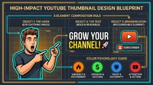
Selecting the best thumbnail fonts is only half the battle; choosing the right colors for that text is equally vital. Your text must maintain a high contrast ratio against the background to ensure it is immediately noticeable. The most reliable color combinations are high-luminance text (white, bright yellow, neon green) on dark backgrounds, or dark text (black, navy blue) on bright backgrounds. You should strictly avoid pairing colors with similar luminance levels, such as red text on a blue background, as these will visually vibrate and become illegible, especially for viewers with color blindness. Utilizing tools to check your WCAG contrast ratios can provide a scientific baseline for legibility. Furthermore, you should consider color psychology: yellow implies energy and caution, red conveys urgency and excitement, while green suggests growth and wealth. Aligning your text color with the emotional tone of your video title is a subtle but powerful way to increase click motivation. The most reliable color combinations are high-luminance text (white, bright yellow, neon green) on dark backgrounds, or dark text (black, navy blue) on bright backgrounds. You should strictly avoid pairing colors with similar luminance levels, such as red text on a blue background, as these will visually vibrate and become illegible, especially for viewers with color blindness. Utilizing tools to check your WCAG contrast ratios can provide a scientific baseline for legibility. Furthermore, you should consider color psychology: yellow implies energy and caution, red conveys urgency and excitement, while green suggests growth and wealth. Aligning your text color with the emotional tone of your video title is a subtle but powerful way to increase click motivation. The most reliable color combinations are high-luminance text (white, bright yellow, neon green) on dark backgrounds, or dark text (black, navy blue) on bright backgrounds. You should strictly avoid pairing colors with similar luminance levels, such as red text on a blue background, as these will visually vibrate and become illegible, especially for viewers with color blindness. Utilizing tools to check your WCAG contrast ratios can provide a scientific baseline for legibility. Furthermore, you should consider color psychology: yellow implies energy and caution, red conveys urgency and excitement, while green suggests growth and wealth. Aligning your text color with the emotional tone of your video title is a subtle but powerful way to increase click motivation.
Ultimately, success is a byproduct of consistency combined with microscopic daily improvements. Do not strive for perfection on day one; strive to make every single upload 1% better than the last in some specific, measurable way. Ultimately, success is a byproduct of consistency combined with microscopic daily improvements. Do not strive for perfection on day one; strive to make every single upload 1% better than the last in some specific, measurable way. Google SEO Starter Guide
YouTube Thumbnail Downloader
YouTube Thumbnail Resizer
Fix Blurry Mobile Thumbnails
High CTR Thumbnail Blueprint
Audience Retention Masterclass
Get 500 Free Views Daily
Best AI Thumbnail Generators
Frequently Asked Questions
There is no single ‘best’ font, but thick, bold sans-serif fonts like Impact, Bebas Neue, and Montserrat Black are consistently the top performers due to their high mobile legibility.
Not always. All-caps is great for urgency and impact, but mixed case (Title Case) can be easier to read for longer phrases and often feels more trustworthy for educational content.
Your main text should be large enough to be easily readable when the thumbnail is scaled down to the size of a postage stamp. Aim for the text to take up at least 20-30% of the canvas.
Using both is usually the most effective strategy. A solid 14px black stroke separates the text from the background, while a hard drop shadow adds depth and lifts the text off the image.
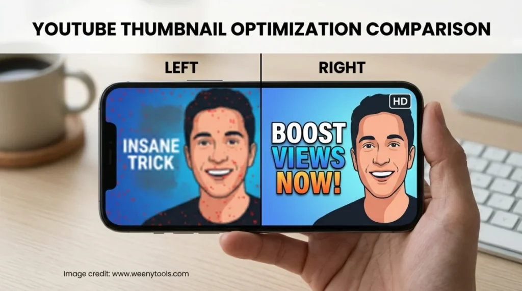
Blurry text on mobile is typically caused by using thin fonts, poor color contrast, or inadequate letter spacing (kerning). Ensure you use bold fonts and increase kerning slightly for small screens.