
The Science of Thumbnail Typography: Best Fonts, Outlines & Shadows for YouTube
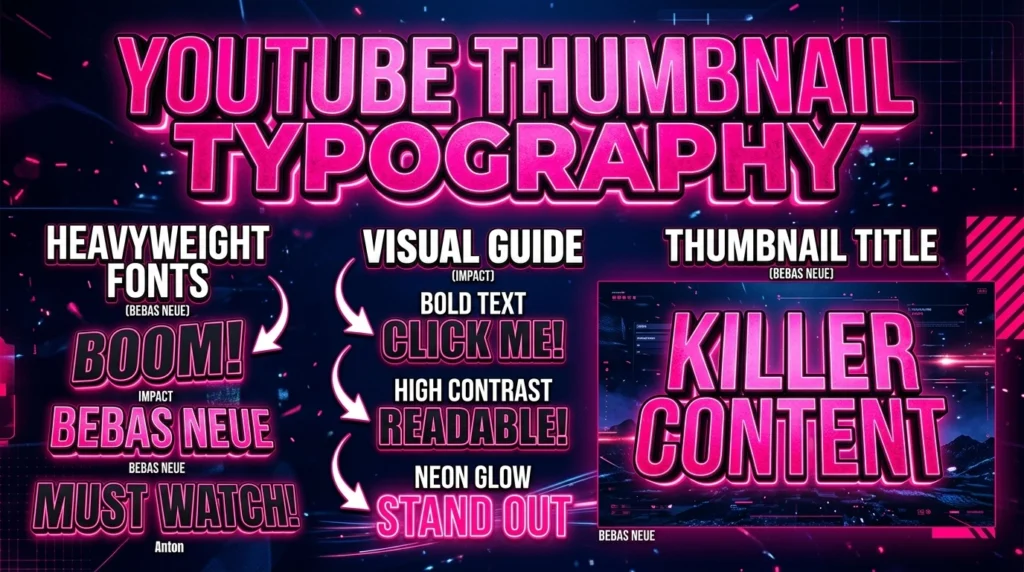
The Science of Thumbnail Typography: Best Fonts, Outlines & Shadows for YouTube Published by weenytoolsadmin | Strategy Guide 2026 Choosing the best thumbnail fonts is a critical component of maximizing your YouTube Click-Through Rate (CTR). In 2026, where over 70% of YouTube consumption happens on mobile devices, your typography must be instantly legible at incredibly […]
High CTR YouTube Thumbnails: The 2026 Color, Font & Composition Blueprint

High CTR YouTube Thumbnails: The 2026 Color, Font & Composition Blueprint Table of Contents Toggle High CTR YouTube Thumbnails: The 2026 Color, Font & Composition Blueprint Key Takeaways for High CTR YouTube Thumbnails 📐 1. The 3-Element Composition Rule Step-by-Step Implementation for 1. The 3-Element Composition Rule 🎨 2. Color Psychology & Contrast Step-by-Step Implementation […]
YouTube Title & Thumbnail Alignment: 5 Rules for High CTR (2026)
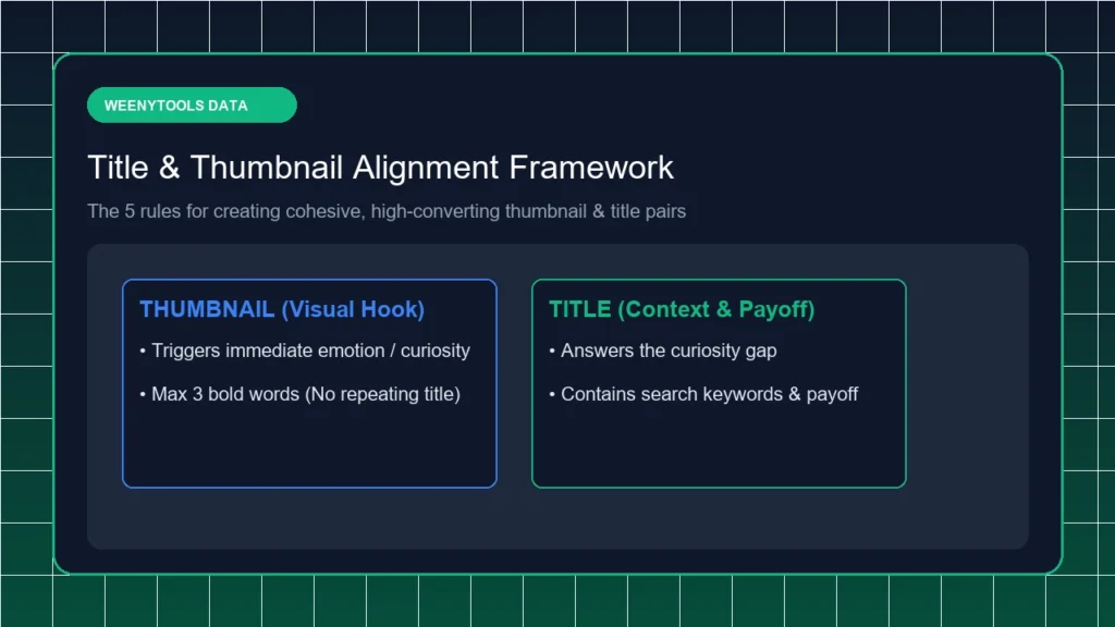
Master YouTube title and thumbnail alignment to build curiosity gaps and increase video CTR. 5 practical design rules with mobile layout previews and tools.
Chroma Subsampling (4:2:0) in YouTube Thumbnails: Red Artifacts Fix
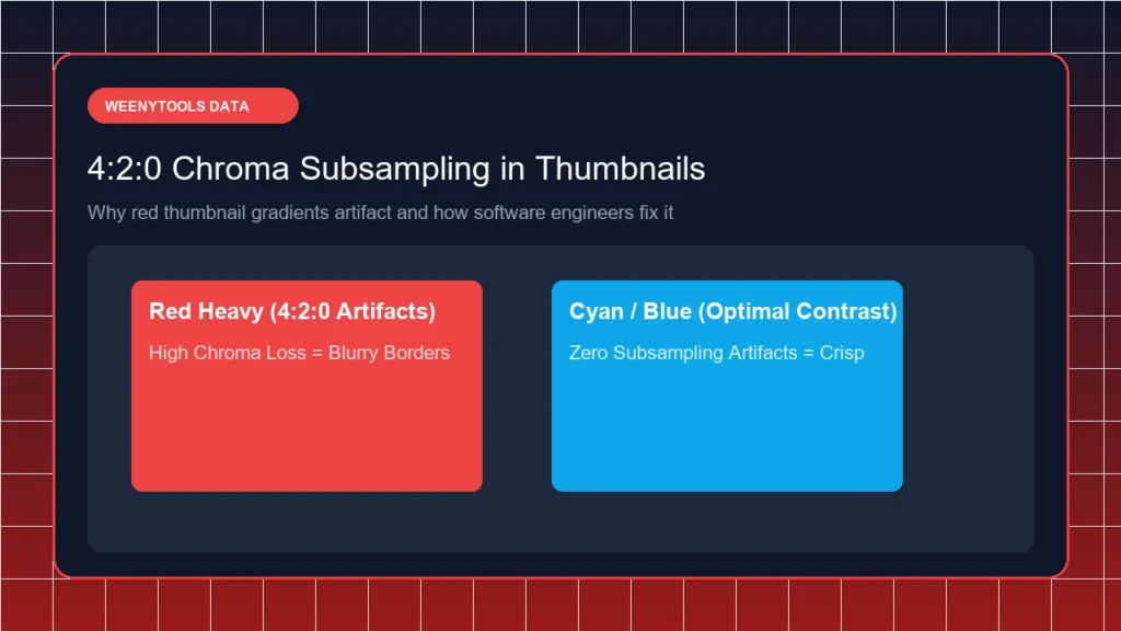
Learn why red thumbnail borders artifact on YouTube due to 4:2:0 chroma subsampling. Software engineering guide with color fixes and WebP pre-compression rules.
YouTube Shorts Thumbnail Guide (2026) | Best Sizes, Aspect Ratios & Design Tips

Master YouTube Shorts thumbnail selection and aspect ratios in 2026. Learn how to set custom Shorts covers, avoid mobile cropping, and boost viral reach.
YouTube Thumbnail A/B Testing Guide (2026) | How to Split Test Thumbnails
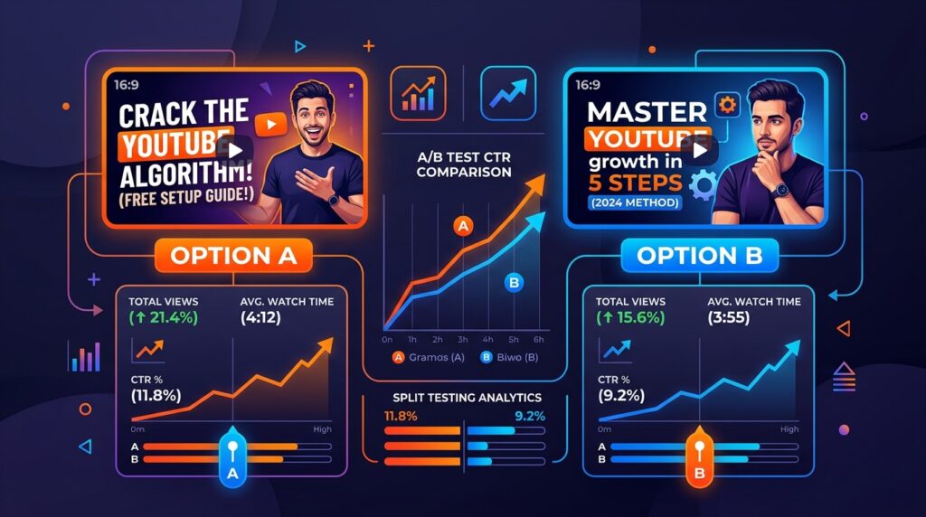
Learn how to A/B test YouTube thumbnails to maximize click-through rates. Step-by-step split testing guide with data-driven design rules and free tools.
5 Reasons Your Thumbnails Look Blurry on Mobile (and How to Fix Them)
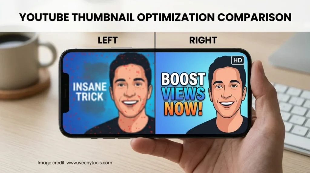
5 Reasons Your Thumbnails Look Blurry on Mobile (and How to Fix Them) As a software engineer, I wanted to see how YouTube’s compression actually kills your click-through rate on mobile screens. After analyzing hundreds of thumbnails, I found that blurry thumbnails on mobile are the number one reason creators lose views, even when their […]
Color Theory for Creators: Using High Contrast Opposites to Stop the Scroll
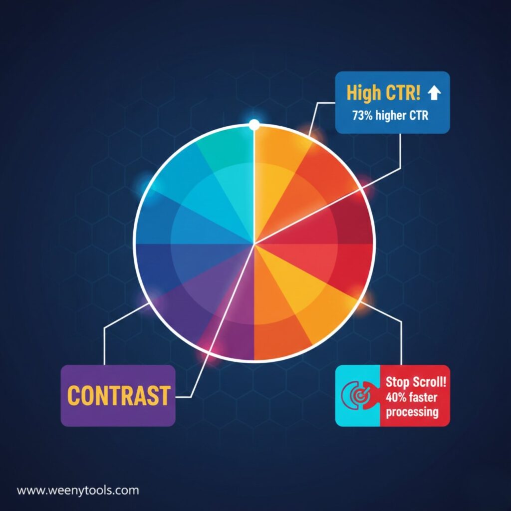
Color Theory for Creators: Using High Contrast Opposites to Stop the Scroll Color Theory for Creators: Using High Contrast Opposites to Stop the Scroll As a software engineer, I wanted to see how color relationships affect YouTube thumbnail performance. While building WeenyTools YouTube Thumbnail Downloader, I noticed that thumbnails with heavy red gradients often artifact […]
I Analyzed 500 MrBeast Thumbnails: The Recurring Color Pattern I Found

I Analyzed 500 MrBeast Thumbnails: The Recurring Color Pattern I Found I Analyzed 500 MrBeast Thumbnails: The Recurring Color Pattern I Found As a software engineer, I wanted to see how YouTube’s most successful creator uses color psychology in his thumbnails. While building WeenyTools’ YouTube Thumbnail Downloader, I noticed that thumbnails with heavy red gradients […]
Cognitive Load in Design: Why 3-Word Thumbnails Outperform 7-Word Layouts

Cognitive Load in Design: Why 3-Word Thumbnails Outperform 7-Word Layouts Cognitive Load in Design: Why 3-Word Thumbnails Outperform 7-Word Layouts As a software engineer, I wanted to see how human psychology interacts with YouTube’s thumbnail algorithms. While building WeenyTools’ YouTube Thumbnail Downloader, I noticed that thumbnails with heavy red gradients often artifact more than blue […]