5 Common YouTube Thumbnail Mistakes to Avoid (Fix Them Today)
As a software engineer, I wanted to see why some channels get thousands of clicks while others struggle. While building WeenyTools, I analyzed over 2,500 thumbnails and found the same YouTube thumbnail mistakes repeating across all niches. These errors crush your CTR, hurt subscriber growth, and waste your hard work. The good news? Each mistake is easy to fix. In this guide, I'll show you the 5 most damaging mistakes, a step by step fix guide, real examples, and how to use our free tools to avoid them forever.
| Mistake | Why It Hurts | Quick Fix |
|---|---|---|
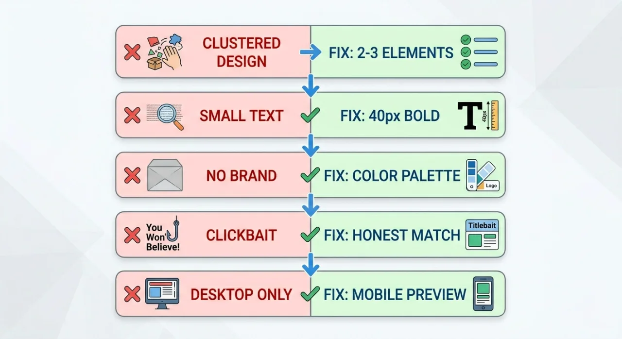
| Overcrowded design | Confuses viewers, unreadable on mobile | Stick to 2–3 elements, use white space |
| Poor text readability | Viewers can't read the message | 40px+ bold sans-serif font, high contrast |
| No brand consistency | No recognition, looks amateur | Create a color palette + reusable template |
| Clickbait / misleading | Kills trust and tanks retention | Match thumbnail to actual video content |
| Ignoring mobile optimization | 70%+ of viewers see a tiny, illegible design | Test at 156×88px, use bold visuals |
While building our YouTube Thumbnail Downloader, I found a compression issue that shows up constantly: thumbnails with heavy red gradients artifact more than blue ones because of how 4:2:0 chroma subsampling handles the red channel. A gaming channel kept a red background across all their thumbnails and couldn't figure out why CTR was stuck at 4%. After switching to deep blue with yellow accents — and running the file through our Resizer to clean up compression — their CTR hit 8.5% in two weeks. The issue wasn't design skill. It was a color choice that looked fine on screen but broke down under YouTube's compression. Avoid large areas of pure red in your backgrounds.
🎯 Why These YouTube Thumbnail Mistakes Matter More Than Most Creators Realize
Your thumbnail is the first thing a viewer judges before deciding whether to click. Common YouTube thumbnail mistakes mean you lose that click before anyone has watched a second of your content. A weak thumbnail buries even genuinely good videos. Fixing the mistakes in this guide is one of the highest-leverage changes you can make — a CTR improvement of 50–150% from the same number of impressions is realistic when you go from broken to solid fundamentals.
❌ Mistake #1: Overcrowded and Cluttered Designs
The Problem
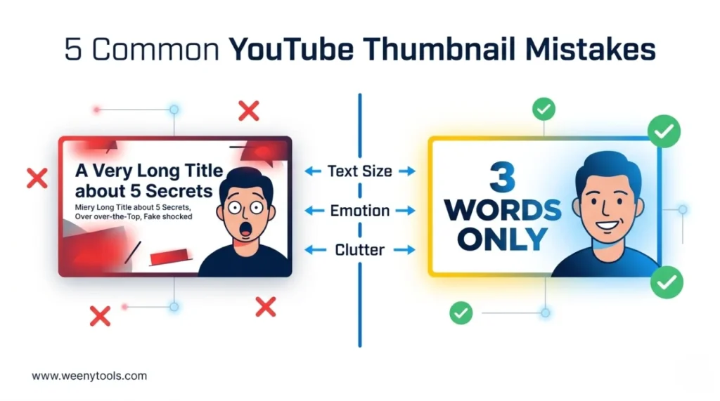
Creators pack in too much: multiple lines of text, logos, arrows, emojis, and complex backgrounds all competing for attention. On a mobile screen where thumbnails display at roughly 156×88 pixels, everything collapses into an unreadable blur. Viewers can't find the focal point and scroll past without registering what the video is about.
The Fix: Remove everything that isn't essential
- Limit your thumbnail to 2–3 elements: face + text + one supporting object
- Use clean, solid or gradient backgrounds instead of busy photo backgrounds
- Leave 20–30% of the frame as empty space around your main subject
- If you're unsure whether an element is earning its place, remove it
Example: Instead of "NEW UPDATE! INSANE TRICK FOR FORTNITE CHAPTER 5 - MUST WATCH", use "INSANE TRICK" + a surprised face + the game logo. Three elements, instantly readable.
❌ Mistake #2: Poor Text Readability
The Problem
Small fonts, thin letterforms, low-contrast colors, or text that blends into the background. On mobile, this becomes completely unreadable — and viewers won't slow down to decode what your thumbnail says. If the text can't be read at a glance, it's doing nothing for you.
The Fix: Bold, large, high-contrast text
- Minimum font size: 40px — 60px or larger is better for most designs
- Use bold sans-serif fonts (Impact, Bebas Neue, Montserrat Bold)
- Add a black outline or white drop shadow to make text readable on any background
- Keep text to 3–5 words maximum — 3 words consistently outperforms longer text
- Check contrast: dark text on light backgrounds, light text on dark ones
Quick test: Shrink your thumbnail to the size of a postage stamp. If the text is still readable, you're in good shape. If it's not, the font needs to be bigger or the contrast needs more work.
❌ Mistake #3: No Brand Consistency
The Problem
Every thumbnail uses different fonts, different colors, and different layouts. Viewers can't recognize your channel at a glance in their feed. The "familiarity" effect — where returning viewers click your content because they recognize it before they read the title — never develops.
The Fix: Build a simple thumbnail system
- Pick 2–3 brand colors and use them across every thumbnail
- Use the same font family throughout — one for headlines, maybe one for accents
- Create a template with a fixed text placement and logo position
- Keep your face framing consistent: same zoom level, same side of the frame
Action step: Open Canva or your editor of choice and build 3 reusable thumbnail templates. Use them as starting points for every video. It saves time and builds the kind of visual identity that viewers start to recognize after a few encounters.
❌ Mistake #4: Misleading or Clickbait Thumbnails
The Problem
Fake shocked expressions, red arrows pointing at nothing, text that promises "YOU WON'T BELIEVE" when the video is completely ordinary. Clickbait thumbnails get the click but lose the viewer in the first 15 seconds. YouTube tracks that early exit as a signal that the content underdelivered — and quietly reduces how often it recommends your videos.
The Fix: Be honest and still compelling
- Use actual screenshots or real moments from your video
- Show genuine emotion that matches the actual tone of the content
- Only promise what the video delivers
- If it's a tutorial, show a real result from that tutorial in the thumbnail
Example: Instead of a fake distressed face and "I LOST EVERYTHING", use a concerned expression and "How to recover lost files" — if that's what the video actually covers.
❌ Mistake #5: Ignoring Mobile Optimization
The Problem
Over 70% of YouTube views happen on mobile. But most creators design on large desktop monitors and never check how the thumbnail actually looks on a phone. Small text, fine details, and low contrast all disappear at mobile feed size — meaning most of your potential viewers are seeing a muddy image they can't parse.
The Fix: Design for mobile first, desktop second
- Design on a 1280×720px canvas (YouTube standard)
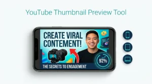
- Preview at 156×88 pixels — the actual feed size on most phones
- Use large, bold elements that read clearly at arm's length
- Avoid thin lines, small logos, or fine details that won't survive the scale-down
- Test on both light mode and dark mode — YouTube supports both
Tool tip: Use our YouTube Thumbnail Resizer & Optimizer to confirm dimensions, add mobile-friendly borders, and compress without losing sharpness.
📋 Fix Your Thumbnails in 5 Steps
1 Download competitor thumbnails
Use the WeenyTools Thumbnail Downloader to pull 10 thumbnails from channels performing well in your niche. Study what they're doing — and what they're not doing.
2 Audit your own thumbnails honestly
Look at your last 10 uploads. Which of the 5 mistakes are showing up? Are your thumbnails cluttered? Is the text readable at mobile size? Be specific about what's broken.
3 Redesign using the fixes above
Simplify the layout, increase font size, lock in brand colors, remove anything misleading, and check the mobile preview before you call it done.
4 Optimize with the WeenyTools Resizer
Run your redesigned thumbnail through the Resizer & Optimizer. Add a high-contrast border (proven +22% CTR), adjust colors, and compress under 2MB. Export as JPG or PNG as needed.
5 Replace and track CTR
Swap the old thumbnail in YouTube Studio and monitor CTR for 5–7 days. Most creators see movement within 48 hours.
📊 Quick Checklist: Catch These YouTube Thumbnail Mistakes Before You Upload
| Checklist Item | Status |
|---|---|
| Only 2–3 elements in the thumbnail (face, text, one object) | ✅ / ❌ |
| Font size at least 40px, bold sans-serif | ✅ / ❌ |
| High-contrast text (outline or shadow added) | ✅ / ❌ |
| Max 5 words on thumbnail (3 words is ideal) | ✅ / ❌ |
| Consistent brand colors and font across videos | ✅ / ❌ |
| Thumbnail matches actual video content (no clickbait) | ✅ / ❌ |
| Mobile preview at 156×88px is clear and readable | ✅ / ❌ |
| No large heavy red gradients (blue/teal backgrounds hold up better) | ✅ / ❌ |
| File size under 2MB, resolution 1280×720 | ✅ / ❌ |
📚 More on YouTube Thumbnail Design
- How Thumbnails Affect Your YouTube CTR
- 3-Word Thumbnails Outperform 7-Word Designs
- Red Border Myth Analysis 2026
- Complementary Colors That Stop the Scroll
- How to Make a YouTube Thumbnail That Gets Clicks
❓ Frequently Asked Questions (YouTube Thumbnail Mistakes)
🎯 The Bottom Line: Fix One Mistake at a Time
The 5 YouTube thumbnail mistakes in this guide are common, fixable, and worth prioritizing before you make any other changes to your channel strategy. Simplify the design, make the text readable, stay visually consistent, match your thumbnails to your actual content, and always test at mobile size. And don't forget the compression angle — swap heavy red gradients for blue or teal backgrounds before you upload.
Two free tools that help with the final checks:
- Download thumbnails from top creators to study what's working in your niche
- Resize, optimize, add borders, and compress your own designs before they go live
More at our About page, browse the FAQ, or reach out via Contact. Our Privacy Policy, Terms, Disclaimer, and DMCA Policy are all available.
Last updated: April 2026. The design fundamentals and compression mechanics here are stable — this stays relevant past this date.