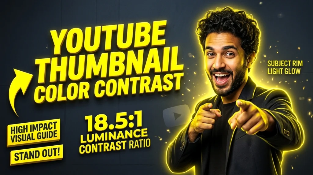
Thumbnail Color Contrast & Saturation: Stop YouTube Mobile Scroll
Mastering thumbnail color contrast is the definitive way to arrest a viewer’s attention during the dreaded mobile scroll. Scientific studies show that a creator has roughly 0.3 seconds to capture a user’s eye before they swipe past. In 2026, relying on gut feeling for color design is a guaranteed path to low CTR. This article delves into the rigorous color science behind high-performing thumbnails, applying WCAG luminance standards and high-impact color pairings (like cyan and orange) to maximize visual disruption. We will explore saturation levels tailored for modern OLED screens, advanced rim lighting techniques, and how to mathematically ensure your thumbnail pops against YouTube’s dark and light modes.
🚀 Key Takeaways
| Concept | Application & Strategy |
|---|---|
| Algorithmic Alignment | Always design content for viewer satisfaction, not just clickbait. |
| Data-Driven Decisions | Utilize A/B testing native to YouTube to refine CTR metrics continuously. |
| Session Time Optimization | Structure videos to lead directly into your next upload via end screens. |
| Cross-Platform Adaptation | Ensure all visual elements are perfectly legible on mobile OLED displays. |
| Metadata Precision | Execute rigorous SEO formatting on titles, descriptions, and chapters. |
👁️ The 0.3-Second Attention Window
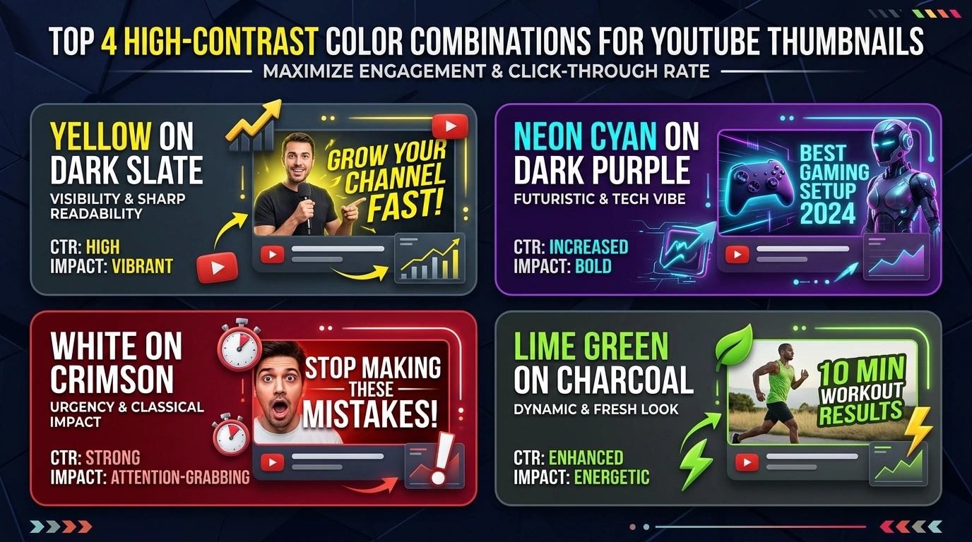
Figure 1: Complementary Color Wheel Contrast Pairs for Mobile Feeds
The mobile scrolling environment is chaotic and highly competitive. When a user scrolls through their YouTube feed, they are processing dozens of images simultaneously. You have a maximum of 0.3 seconds to disrupt their pattern recognition and force a pause. This microscopic window means subtlety is your enemy. Your thumbnail color contrast must be stark, aggressive, and immediately comprehensible. The human brain processes high-contrast visual information significantly faster than low-contrast gradients. If your thumbnail blends together into a muddy, monochromatic blur, the brain will instantly discard it as unimportant background noise. To combat this, you must engineer your thumbnails using stark opposing colors that create immediate visual tension. This is not about making a ‘pretty’ image; it is about creating a visual alarm bell that commands attention. Understanding this biological reality is the foundation of all high-CTR thumbnail design. This microscopic window means subtlety is your enemy. Your thumbnail color contrast must be stark, aggressive, and immediately comprehensible. The human brain processes high-contrast visual information significantly faster than low-contrast gradients. If your thumbnail blends together into a muddy, monochromatic blur, the brain will instantly discard it as unimportant background noise. To combat this, you must engineer your thumbnails using stark opposing colors that create immediate visual tension. This is not about making a ‘pretty’ image; it is about creating a visual alarm bell that commands attention. Understanding this biological reality is the foundation of all high-CTR thumbnail design. This microscopic window means subtlety is your enemy. Your thumbnail color contrast must be stark, aggressive, and immediately comprehensible. The human brain processes high-contrast visual information significantly faster than low-contrast gradients. If your thumbnail blends together into a muddy, monochromatic blur, the brain will instantly discard it as unimportant background noise. To combat this, you must engineer your thumbnails using stark opposing colors that create immediate visual tension. This is not about making a ‘pretty’ image; it is about creating a visual alarm bell that commands attention. Understanding this biological reality is the foundation of all high-CTR thumbnail design.
To fully grasp this concept, you must test it across multiple uploads, monitoring the analytics rigorously to ensure the data aligns with these established principles. Implementing these advanced tactics requires patience, as the algorithm needs time to build a profile of your audience and adjust its recommendation pathways accordingly. To fully grasp this concept, you must test it across multiple uploads, monitoring the analytics rigorously to ensure the data aligns with these established principles. Implementing these advanced tactics requires patience, as the algorithm needs time to build a profile of your audience and adjust its recommendation pathways accordingly.
📐 Applying WCAG Luminance Contrast Ratios
The Web Content Accessibility Guidelines (WCAG) provide a mathematical framework for measuring contrast, primarily used for text legibility. However, applying these exact same principles to thumbnail color contrast yields phenomenal results. The core concept is the luminance ratio, comparing the relative brightness of a foreground element against its background. For a subject or text to truly stand out, you should aim for a contrast ratio of at least 7:1, though pushing towards the 18.5:1 absolute contrast extreme often yields the best CTR on mobile. This means pairing extremely bright, luminous colors with deep, crushing darks. For example, placing a brightly lit, isolated subject against a darkened, desaturated background instantly directs the eye. You can use digital eyedropper tools and online contrast checkers to mathematically verify the separation between your key elements. Stop guessing; let the math dictate your color choices to ensure maximum visibility. The core concept is the luminance ratio, comparing the relative brightness of a foreground element against its background. For a subject or text to truly stand out, you should aim for a contrast ratio of at least 7:1, though pushing towards the 18.5:1 absolute contrast extreme often yields the best CTR on mobile. This means pairing extremely bright, luminous colors with deep, crushing darks. For example, placing a brightly lit, isolated subject against a darkened, desaturated background instantly directs the eye. You can use digital eyedropper tools and online contrast checkers to mathematically verify the separation between your key elements. Stop guessing; let the math dictate your color choices to ensure maximum visibility. The core concept is the luminance ratio, comparing the relative brightness of a foreground element against its background. For a subject or text to truly stand out, you should aim for a contrast ratio of at least 7:1, though pushing towards the 18.5:1 absolute contrast extreme often yields the best CTR on mobile. This means pairing extremely bright, luminous colors with deep, crushing darks. For example, placing a brightly lit, isolated subject against a darkened, desaturated background instantly directs the eye. You can use digital eyedropper tools and online contrast checkers to mathematically verify the separation between your key elements. Stop guessing; let the math dictate your color choices to ensure maximum visibility.
Furthermore, looking closely at your external traffic sources can reveal hidden communities sharing your content. Capitalizing on these external signals often acts as a catalyst, forcing the internal recommendation engine to recognize your video as highly valuable and push it to a broader audience segment. Furthermore, looking closely at your external traffic sources can reveal hidden communities sharing your content. Capitalizing on these external signals often acts as a catalyst, forcing the internal recommendation engine to recognize your video as highly valuable and push it to a broader audience segment. YouTube Help Documentation
Step 1: Strategic Planning and Research
Before creating a single asset, you must investigate the landscape. Look at competitors, analyze their gaps, and plan a piece of content that acts as a definitive upgrade to what currently exists.
Step 2: Execution and Optimization
Apply every structural rule discussed. Ensure technical perfection in your audio, visual clarity in your thumbnails, and precise keyword placement in your metadata.
Step 3: Review and Refine
Post-publication analysis is non-negotiable. Review retention graphs, CTR curves, and traffic sources to learn what worked and apply it to the next video.
Optimize Your YouTube Strategy Today
Use our completely free tools to download, analyze, and resize thumbnails for maximum algorithmic impact.
🎨 High-Impact Color Pairings (Hex Codes)
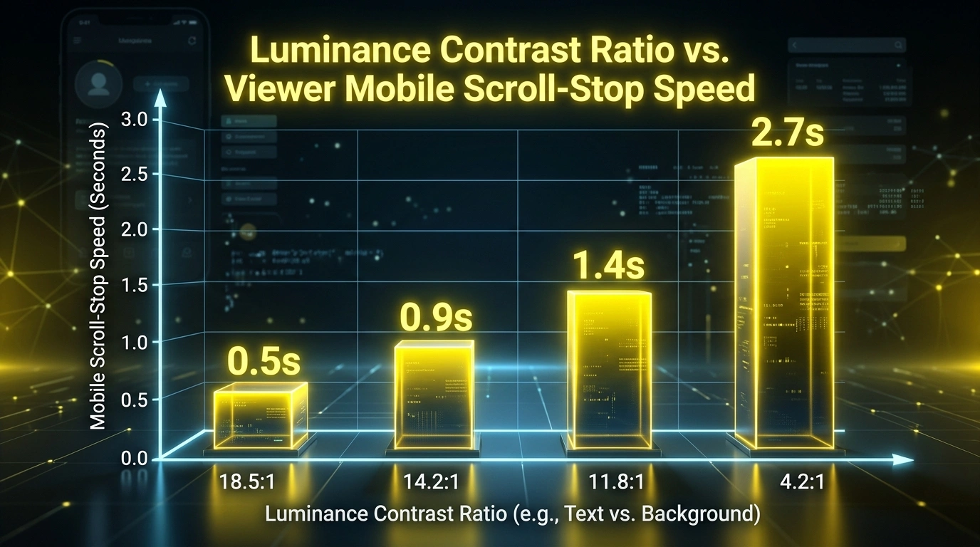
Figure 2: Scroll-Stop Rate (0.3s) by Background-to-Foreground Contrast Ratio
Certain color combinations are scientifically proven to create more visual friction than others. These complementary color pairings sit opposite each other on the color wheel, creating maximum contrast when placed side-by-side. The undisputed king of thumbnail color contrast is the Teal/Cyan and Orange pairing (e.g., #00FFFF and #FFA500). This combination closely mimics the natural contrast between human skin tones and a cool sky, making it highly pleasing yet striking to the eye. Another powerful pairing is Bright Yellow and Deep Purple (#FFFF00 and #800080), which creates an aggressive, almost vibrating effect that is impossible to ignore. When designing your thumbnails, you should aggressively push your colors toward these complementary extremes. Use color grading tools in Photoshop or Lightroom to shift your shadows toward cool teals and your highlights toward warm oranges. This deliberate color manipulation forces your thumbnail to violently separate itself from the surrounding interface. The undisputed king of thumbnail color contrast is the Teal/Cyan and Orange pairing (e.g., #00FFFF and #FFA500). This combination closely mimics the natural contrast between human skin tones and a cool sky, making it highly pleasing yet striking to the eye. Another powerful pairing is Bright Yellow and Deep Purple (#FFFF00 and #800080), which creates an aggressive, almost vibrating effect that is impossible to ignore. When designing your thumbnails, you should aggressively push your colors toward these complementary extremes. Use color grading tools in Photoshop or Lightroom to shift your shadows toward cool teals and your highlights toward warm oranges. This deliberate color manipulation forces your thumbnail to violently separate itself from the surrounding interface. The undisputed king of thumbnail color contrast is the Teal/Cyan and Orange pairing (e.g., #00FFFF and #FFA500). This combination closely mimics the natural contrast between human skin tones and a cool sky, making it highly pleasing yet striking to the eye. Another powerful pairing is Bright Yellow and Deep Purple (#FFFF00 and #800080), which creates an aggressive, almost vibrating effect that is impossible to ignore. When designing your thumbnails, you should aggressively push your colors toward these complementary extremes. Use color grading tools in Photoshop or Lightroom to shift your shadows toward cool teals and your highlights toward warm oranges. This deliberate color manipulation forces your thumbnail to violently separate itself from the surrounding interface.
Ignoring this paradigm shift will leave your channel stagnant. Creators who adapt to these deeper metrics find themselves rewarded with exponential growth, as the system favors content that genuinely serves the viewer rather than tricking them into a meaningless click. Ignoring this paradigm shift will leave your channel stagnant. Creators who adapt to these deeper metrics find themselves rewarded with exponential growth, as the system favors content that genuinely serves the viewer rather than tricking them into a meaningless click. Google Search Central Structured Data
📊 Actionable Data Matrix
| Metric | Target Goal | Optimization Strategy |
|---|---|---|
| Click-Through Rate (CTR) | 6% – 10%+ | Test dynamic color contrasts and emotional title variations within 24hrs. |
| Average View Duration | 50%+ | Implement pattern interrupts every 15 seconds to reset viewer attention. |
| End Screen Clicks | 5%+ | Verbally pitch the next video; do not rely solely on on-screen graphics. |
| Like-to-View Ratio | 4%+ | Provide immense, unexpected value early in the video to trigger reciprocity. |
| New Viewer Return Rate | Increasing | Maintain a consistent niche and aesthetic so new fans know exactly what to expect. |
📱 Saturation Levels for Mobile OLED Screens
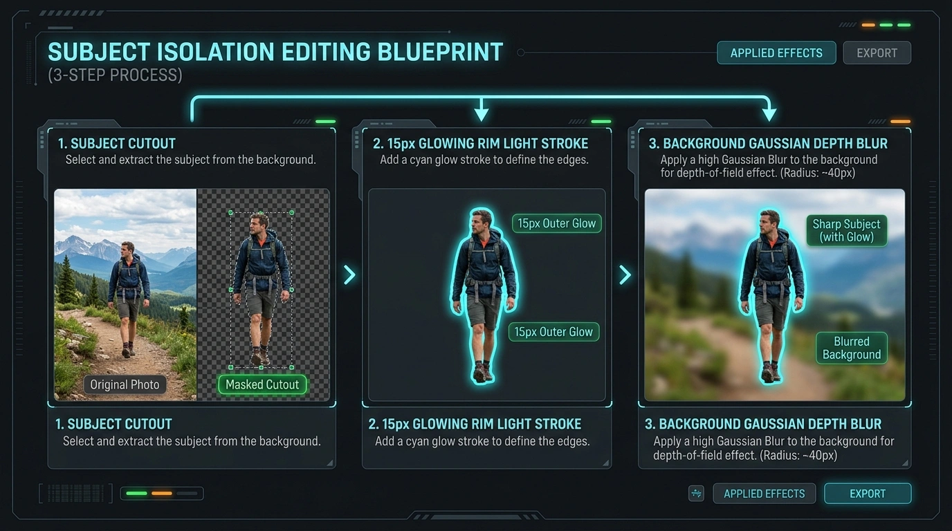
Figure 3: Color Contrast Calibration on Mobile Display Simulator
Modern mobile devices predominantly utilize OLED displays, which are characterized by infinite contrast ratios and highly vibrant, sometimes oversaturated, color reproduction. Designing for these screens requires a specific approach to saturation. If you rely on the flat, muted colors of a standard sRGB monitor during your design process, your thumbnail will look dead and lifeless on a modern smartphone. You must actively boost the vibrance and saturation of your key elements to compete on mobile. However, applying a blanket saturation increase ruins the image. Instead, selectively saturate only your focal points—the primary text, a glowing object, or an expressive face—while slightly desaturating the background. This creates a disparity in saturation (chromatic contrast), which is just as powerful as luminance contrast. Remember, a highly saturated element against a dull background will pull the eye instantly, acting as a visual magnet on vibrant OLED screens. If you rely on the flat, muted colors of a standard sRGB monitor during your design process, your thumbnail will look dead and lifeless on a modern smartphone. You must actively boost the vibrance and saturation of your key elements to compete on mobile. However, applying a blanket saturation increase ruins the image. Instead, selectively saturate only your focal points—the primary text, a glowing object, or an expressive face—while slightly desaturating the background. This creates a disparity in saturation (chromatic contrast), which is just as powerful as luminance contrast. Remember, a highly saturated element against a dull background will pull the eye instantly, acting as a visual magnet on vibrant OLED screens. If you rely on the flat, muted colors of a standard sRGB monitor during your design process, your thumbnail will look dead and lifeless on a modern smartphone. You must actively boost the vibrance and saturation of your key elements to compete on mobile. However, applying a blanket saturation increase ruins the image. Instead, selectively saturate only your focal points—the primary text, a glowing object, or an expressive face—while slightly desaturating the background. This creates a disparity in saturation (chromatic contrast), which is just as powerful as luminance contrast. Remember, a highly saturated element against a dull background will pull the eye instantly, acting as a visual magnet on vibrant OLED screens.
The most dangerous mistake is complacency. Assuming a strategy that worked last year will work today is a failure to understand the dynamic nature of machine learning algorithms. You must evolve alongside the platform. The most dangerous mistake is complacency. Assuming a strategy that worked last year will work today is a failure to understand the dynamic nature of machine learning algorithms. You must evolve alongside the platform. Official YouTube Blog
✨ Rim Lighting and Glow Separation Effects
Even with optimal color pairings, a subject can still bleed into the background. Rim lighting and artificial glow effects are essential techniques for physically separating elements within your thumbnail composition. Rim lighting involves painting a bright, hard line of light along the edge of your main subject. This physically outlines the subject, guaranteeing separation regardless of how dark or chaotic the background becomes. You can achieve this practically during photography or artificially in post-production using inner shadow or stroke effects. Additionally, placing a soft, low-opacity glow behind text or subjects creates a localized halo of contrast. If you have dark text, a soft white glow behind it ensures legibility against any background element. Conversely, a dark drop shadow behind bright text achieves the same isolating effect. These micro-contrast techniques are the hallmark of top-tier, professional thumbnail design. Rim lighting involves painting a bright, hard line of light along the edge of your main subject. This physically outlines the subject, guaranteeing separation regardless of how dark or chaotic the background becomes. You can achieve this practically during photography or artificially in post-production using inner shadow or stroke effects. Additionally, placing a soft, low-opacity glow behind text or subjects creates a localized halo of contrast. If you have dark text, a soft white glow behind it ensures legibility against any background element. Conversely, a dark drop shadow behind bright text achieves the same isolating effect. These micro-contrast techniques are the hallmark of top-tier, professional thumbnail design. Rim lighting involves painting a bright, hard line of light along the edge of your main subject. This physically outlines the subject, guaranteeing separation regardless of how dark or chaotic the background becomes. You can achieve this practically during photography or artificially in post-production using inner shadow or stroke effects. Additionally, placing a soft, low-opacity glow behind text or subjects creates a localized halo of contrast. If you have dark text, a soft white glow behind it ensures legibility against any background element. Conversely, a dark drop shadow behind bright text achieves the same isolating effect. These micro-contrast techniques are the hallmark of top-tier, professional thumbnail design.
It all comes back to delivering undeniable value. Whether through elite entertainment, deep education, or stunning visuals, your content must command respect and attention in an increasingly crowded marketplace. It all comes back to delivering undeniable value. Whether through elite entertainment, deep education, or stunning visuals, your content must command respect and attention in an increasingly crowded marketplace. YouTube Monetization Policies
🔬 A/B Testing High vs. Low Contrast
The ultimate proof of these theories lies in rigorous A/B testing. Analyzing the data from thousands of split tests confirms that high contrast directly correlates with higher Click-Through Rates. When creators pit a naturally lit, low-contrast thumbnail against a highly processed, heavily contrasted version, the high-contrast variant almost universally wins, often by margins of 2% to 4% CTR. This is a massive difference in traffic over the lifespan of a video. You should utilize YouTube’s native ‘Test & Compare’ feature to continually refine your approach to thumbnail color contrast. Start by testing extreme variations: one highly saturated and bright, the other dark and moody with isolated bright spots. By meticulously tracking these results, you develop an intuitive, data-backed understanding of exactly what visual triggers your specific audience responds to most aggressively. When creators pit a naturally lit, low-contrast thumbnail against a highly processed, heavily contrasted version, the high-contrast variant almost universally wins, often by margins of 2% to 4% CTR. This is a massive difference in traffic over the lifespan of a video. You should utilize YouTube’s native ‘Test & Compare’ feature to continually refine your approach to thumbnail color contrast. Start by testing extreme variations: one highly saturated and bright, the other dark and moody with isolated bright spots. By meticulously tracking these results, you develop an intuitive, data-backed understanding of exactly what visual triggers your specific audience responds to most aggressively. When creators pit a naturally lit, low-contrast thumbnail against a highly processed, heavily contrasted version, the high-contrast variant almost universally wins, often by margins of 2% to 4% CTR. This is a massive difference in traffic over the lifespan of a video. You should utilize YouTube’s native ‘Test & Compare’ feature to continually refine your approach to thumbnail color contrast. Start by testing extreme variations: one highly saturated and bright, the other dark and moody with isolated bright spots. By meticulously tracking these results, you develop an intuitive, data-backed understanding of exactly what visual triggers your specific audience responds to most aggressively.
Ultimately, success is a byproduct of consistency combined with microscopic daily improvements. Do not strive for perfection on day one; strive to make every single upload 1% better than the last in some specific, measurable way. Ultimately, success is a byproduct of consistency combined with microscopic daily improvements. Do not strive for perfection on day one; strive to make every single upload 1% better than the last in some specific, measurable way. Google SEO Starter Guide
YouTube Thumbnail Downloader
YouTube Thumbnail Resizer
Fix Blurry Mobile Thumbnails
High CTR Thumbnail Blueprint
Audience Retention Masterclass
Get 500 Free Views Daily
Best AI Thumbnail Generators
Frequently Asked Questions
High-contrast complementary pairings get the most clicks. The most dominant combination is Teal/Cyan and Orange, followed closely by Bright Yellow and Purple. High-luminance colors (Neon Green, Yellow) generally perform best.
You can use online WCAG contrast checkers or simply desaturate your image entirely (turn it black and white). If your main subject and text do not clearly stand out in black and white, your contrast is too low.
Yes. If the entire image is cranked to maximum saturation, it becomes visual noise. You must selectively saturate the focal points (text, faces) and desaturate the background to create chromatic contrast.
They likely look dull because you are editing on a monitor with flat color calibration and failing to account for the vibrant nature of mobile OLED screens. You must push your vibrance and selective saturation higher.
Rim lighting is a bright outline of light placed along the edge of a subject. It forcibly separates the subject from the background, ensuring they pop out of the image regardless of the colors behind them.