YouTube thumbnails are the very first thing that viewers notice when they are scrolling through their feed, making them incredibly important. A single, well-designed image has the power to determine whether your video is clicked on or completely ignored by potential viewers. Despite this crucial role, many creators continue to make the same common mistakes repeatedly, which significantly harms their click-through rate (CTR) and reduces the overall reach and success of their videos.
This post thoroughly explains the top 5 most common YouTube thumbnail mistakes that many creators often make. Additionally, it provides you with practical, actionable tips and strategies to effectively fix these issues. By following these carefully outlined steps, you can make your videos truly stand out from the crowd and significantly improve your audience engagement almost instantly.
Why Thumbnails Matter (YouTube Thumbnail Mistakes)
Over 90% of the highest-performing YouTube videos utilize custom thumbnails to stand out. Your thumbnail serves as your very first impression and represents the most crucial opportunity to grab viewers’ attention in less than three seconds. A professionally designed, straightforward, and visually clear thumbnail can boost your click-through rate (CTR) by more than 150%, significantly enhancing your video’s reach and engagement.
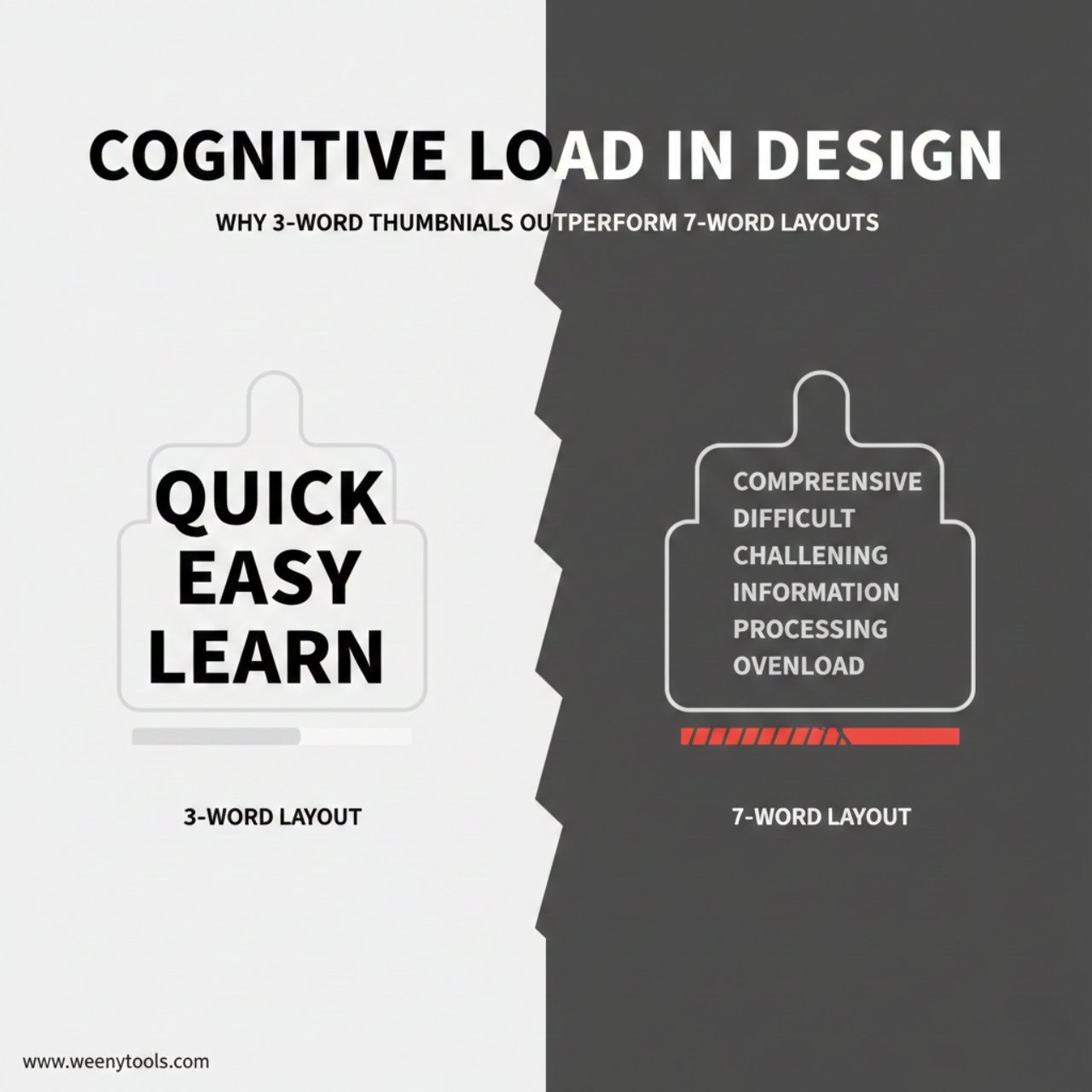
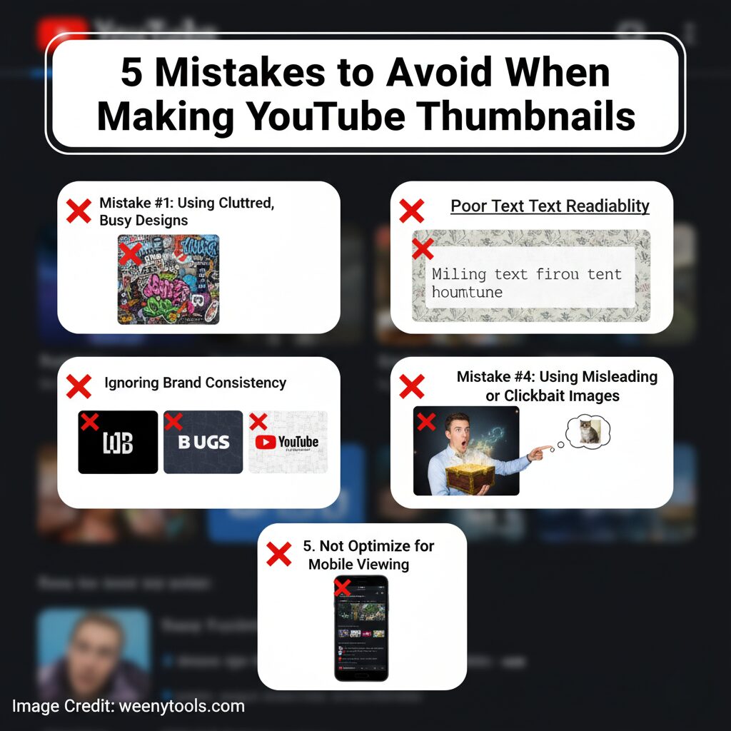
Mistake #1: Overcrowded and Cluttered Designs
The Problem:
Many creators tend to fill every available corner of their thumbnail with an overwhelming amount of text, logos, emojis, and various unnecessary graphics. This cluttered approach makes the image difficult to read and understand at a glance, especially on smaller screens like those of mobile devices. Since the majority of people watch YouTube videos on their phones, this can significantly reduce the effectiveness and appeal of the thumbnail.
- Too many colors and text layers
- Unclear focal point
- Distracting background elements
- Overlapping graphics and images
The Fix:
Concentrate on delivering one clear and impactful visual message that immediately captures attention. Utilize clean, uncluttered layouts and incorporate ample white space to create a balanced design. This approach ensures that viewers can quickly and effortlessly understand the purpose of your thumbnail at a single glance without any confusion.
- Stick to 2–3 main elements maximum
- Use simple backgrounds
- Highlight one key subject or face
- Keep the text short and bold
Mistake #2: Poor Text Readability
The Problem:
Unreadable text is one of the most frequent and noticeable mistakes found in thumbnails. Using very small font sizes, having weak or insufficient color contrast, or choosing overly fancy and intricate fonts often makes the intended message difficult to read and understand clearly. These issues can significantly reduce the effectiveness of the thumbnail in conveying its purpose.
- Fonts too small for mobile screens
- Poor contrast with background colors
- Decorative fonts that reduce clarity
- Text blending into the image
The Fix:
Use large, bold, high-contrast text that is designed to remain easily readable and clear even when it is reduced to smaller sizes on different devices or screens. This ensures that the text maintains its legibility and effectiveness regardless of the viewing context or resolution.
- Minimum font size: 40px
- Use bold, sans-serif fonts
- Apply text outlines or shadows
- Keep text between 3–5 words
Mistake #3: No Brand Consistency
The Problem:
Using a variety of different styles, fonts, and colors for every single video can make your channel appear unprofessional and inconsistent. This lack of uniformity can confuse viewers and make it difficult for them to quickly recognize and identify your content when browsing through their feed. Consistency in visual elements is key to building a strong, recognizable brand presence.
The Fix:
- Create a color palette and stick to it
- Use the same fonts for all thumbnails
- Keep your logo or brand element visible
- Maintain similar layouts for video series
Consistency builds strong recognition over time. When viewers repeatedly encounter your unique design style across multiple videos, they begin to develop trust in your content and are more likely to click on your videos more quickly and frequently. This repeated exposure helps establish a familiar and reliable presence that attracts and retains an audience.
Tip: You can easily download and carefully study thumbnails from a wide range of successful creators using our handy YouTube Thumbnail Downloader. This tool allows you to analyze and understand which styles, colors, and designs perform best to help improve your own content’s visual appeal and engagement.
Mistake #4: Misleading or Clickbait Thumbnails
The Problem:
Clickbait tactics might initially capture people’s attention rapidly, drawing them into clicking on your videos. However, relying on misleading thumbnails can cause significant long-term damage to your channel’s reputation and overall trustworthiness. When viewers click on a video expecting content that matches the exciting or dramatic thumbnail, but instead find something completely different, they often feel disappointed and deceived. This sense of being misled can lead to viewers losing faith in your channel, making them less likely to return for future content. Consequently, they may leave the video early, which lowers your overall watch time and negatively impacts your credibility with your audience. Therefore, it is crucial to maintain honesty and accuracy in your thumbnails to foster a loyal, engaged, and trusting viewer base that values the content you provide.
- Fake shocked faces or overreactions
- Unrelated or exaggerated visuals
- Titles that overpromise results
- Using content not found in the video
The Fix:
- Use real video screenshots or scenes
- Show genuine expressions
- Focus on true value or emotion
- Represent your content honestly
Clickbait might attract a surge of clicks initially, but it is honesty and authenticity that truly cultivate a dedicated and loyal base of subscribers over time.
Mistake #5: Ignoring Mobile Optimization
The Problem:
Over 70% of all YouTube views occur on mobile devices such as smartphones and tablets. Despite this significant majority, many content creators still design their thumbnails primarily with desktop viewers in mind, overlooking the fact that most of their audience is actually accessing their videos on smaller screens. This means they miss out on optimizing their thumbnails for the devices where the majority of views happen.
- Text unreadable on phone screens
- Fine details lost after compression
- Low contrast on small displays
The Fix:
- Design thumbnails at 1280×720 px resolution
- Test visibility at 156×88 px (mobile preview)
- Use bold visuals and clean fonts
- Check appearance on multiple devices
Mobile Testing Checklist
- ✓ Preview thumbnails on both Android and iPhone
- ✓ Test visibility in daylight and dark mode
- ✓ Confirm text clarity at small size
- ✓ Check CTR in YouTube Studio analytics

Bonus: Quick Thumbnail Quality Checklist
Design Quality
- Readable text (40px+ font)
- Strong contrast and color balance
- One main focal point
- Brand color consistency
Technical Quality
- Resolution: 1280×720 px
- File size under 2 MB
- Format: JPG or PNG
- Mobile-friendly composition
Recommended Tools
- Design: Canva, Photoshop, GIMP
- Testing: BrowserStack, Mobile Preview
- Analytics: YouTube Studio CTR tracking
Ready to Improve Your Thumbnails?
Start by carefully studying what works best in the world of YouTube thumbnails. Use our Free YouTube Thumbnail Downloader to easily download thumbnails from some of the highest-performing and most popular videos. Take the time to analyze their design elements, color schemes, and composition, then use these insights to create even better, more eye-catching versions tailored specifically for your own channel. Download Thumbnails Now and start improving your content’s visual appeal today.